Silk Brocades and Xuan Paper
This page describes the characteristics of the silks and papers offered for custom Asian calligraphy wall scrolls and paintings.
Most Popular Silk Choices
I buy thousands of yards of these 3 silks every year (and thus I get a good price from the mill)...
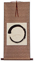
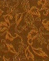
Copper
This is a darker silk that some might call deep gold or an almost reddish-brown.
This looks great with nearly any paper color, and any color of decor in your home.
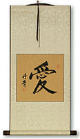
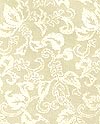
Ivory
Your computer monitor may not display this color correctly. It is almost-white silk with a warm yellow hue. Some people call this "antique white" or "ivory".
This goes well with darker papers like tan or red.
White
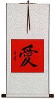
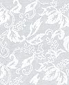
White is a great all-purpose silk color that fits with almost every decor.
This goes well with all paper colors except beige or white
Specialty Silk Brocades + $2
For a variety of reasons, the following silk colors/textures cost a little more...

Frost Green
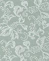
This is a fresh light green color that some people will call "misty mint", or "Irish white".
Your computer monitor may be showing this a bit darker than the true color. When the light hits this silk just right, it almost looks white.
Looks great with tan paper. Also good with lighter colors. Not a good match with red!

Frost Blue
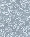
This is a special-purpose silk. Make sure it will match your decor. Some people will call this "baby blue" or "powder blue".
Make your own judgment, but this silk should probably be matched with a lighter color such as beige paper.

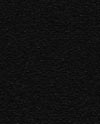
Plain Black
A black wall scroll is a very rare thing in Asia. I offer this color because of western customers kept asking for it.
I had to get this custom made at the mill, so I'm sure this is the only place in Asia where you'll find black silk.
Great for funerals or wakes?

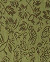
Medium Green
I'm having trouble getting large batches of medium green. The shade and pattern of green you receive may vary from the image here (each small batch that arrives at the workshop is slightly different).
Green silk looks great with tan paper and all other papers except reds and blues.

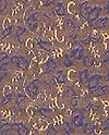
Blue / Gold
I call this silk Crazy Blue/Gold for a reason!
This silk can appear to be blue or a golden-yellow depending on the angle you view it from, and lighting. It is really hard to get a good picture of this silk as it changes color depending on the angle and kind of light that hits it.

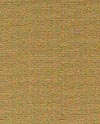
Plain Mocha
Before silk brocades were both common and shiny, this was the kind of silk you would find on a wall scroll. This silk is plain, and not very shiny at all. If want the look of an antique scroll from hundreds of years ago, this is a great choice.

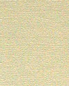
Plain Ivory
Before silk brocades were both common and shiny, this was the kind of silk you would find on a wall scroll. This silk is plain with just a hint of sheen. If want the look of an antique scroll from hundreds of years ago, this is a great choice.


Plain White
Before silk brocades were both common and shiny, this was the kind of silk you would find on a wall scroll. This silk is plain without much shine. If want the look of a white scroll from hundreds of years ago, this is the best choice.

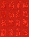
Bright Red
This is a bright and vivid red color. Every time I get another batch, the pattern changes slightly. It might be characters as seen here, or some traditional circular pattern.
Red is the ultimate good-luck color in Chinese culture.

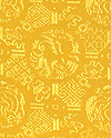
Emperor Yellow
This is a very bright yellow. It may be overwhelming if your room has a more subdued decor. But if you are looking for something bright and over-the-top (like the Emperor himself), this is it.
Note: A few hundred years ago, only the Emperor was allowed to posses clothing or items of this color. If you go back in time, you might get executed if you hang this on your wall.
Xuan Papers
Please note that not all papers are available from all calligraphers. Each master calligrapher has all but one or two of these in stock in their studio. For example, the standard/economy calligrapher offers just 8 of these paper options.
Premium xuan paper with gold flakes
These gold flakes are not the first thing you notice on a calligraphy wall scroll, but they add something special to the artwork. High-quality calligraphy is often seen on this quality paper. Especially good for gifts.
Don't let these images or your computer monitor fool you, these gold-flake papers are more subtle than they appear on your computer screen, and look great in real life (just really hard to accurately photograph).
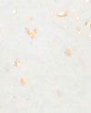
Beige w/Gold Flecks
This is a very common color for calligraphy. Artists refer to this paper as "white" in Chinese, but if you hold a sheet of white computer paper next to it, it becomes obvious that his is a non-bleached natural beige color.
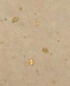
Tan w/Gold Flecks
This one of my personal favorites for calligraphy. This tan color gives a very classic look to a wall scroll, especially when matched with gold silk.

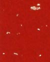
Red w/Gold Flecks
Red paper is great for very special, seasonal, or festive calligraphy. If you are getting a double happiness or any phrase on a wall scroll for a wedding, this is a great choice. In China, red is both a festive and good luck color.

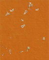
Buddha Orange w/Gold Flecks
This is also known as Buddha Orange. This is a common color for Buddhist-related phrases, words and scripture.
This goes best with white or ivory silk.

Yellow Hue w/Gold Flecks
Depending on your decor, this paper can look a bit yellow. This is especially true if you hand it on a very white wall. This color is probably suitable in a darker room with brown and natural tones - not my first choice, as I think tan or beige more safely match various decors.
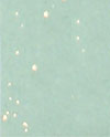
Light Blue w/Gold Flecks
This color does not match most other silks. I suggest white silk only. Matching this with blue would just be "too blue". Choose this paper cautiously - and only if you have a special reason to do so.
Special Handmade Papers
While technically, all xuan paper is handmade, these papers received special treatments during the paper-making process.
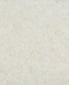
Natural Fiber
If you are considering plain white paper because you are not a fan of gold flakes, I suggest that you first consider this paper. This is a little warmer in color than the plain white. If you look closely at the actual paper, you find fibers are uniform in color and size, and give the paper a natural handmade look without extra chunks and color deviations.
Personally, I like the more chunky fiber in the "grass fiber paper" (the paper one space to the right of this one) but this is a personal preferance. If I really wanted something plain and almost white, this is the one I would choose.
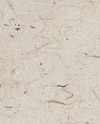
Grass Fiber
In Chinese, this is called "Leather-Grass Paper". The visual texture is somewhat like leather, and the grass part of the title refers to the fibers of "rice grass" and/or hemp that are allowed to mix with the pulp and remain embedded and pressed in the paper. It has a very natural and organic look.
If you want your wall scroll to have a unique look, this is the paper. This is one of my personal favorites. One customer commented that this paper is perfect for a granola-lover.
Please note that the ink of the calligraphy tends to not penetrate the more chunky areas of this paper. This should not be seen as a defect, but as something that enhances the uniqueness of your handmade artwork.
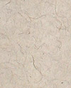
Hairy Paper
This paper is crazy. It is known as "hair paper" in Chinese. It actually has fibers that look like tiny wavy hairs embedded in the paper. I have not been able to get an answer as to whether these are real animal or human hairs, or just plant fibers that look like hair.
My little picture on the web can not accurately show the tiny hairs, so you will just have to take my word for it. Please only choose this paper if you are looking for something very different - it will be a conversation piece for anyone who takes a close look at the paper on your wall scroll.
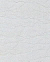
Watermark
This is a very cool and special paper. It has a pattern that looks like a series of watermarks. It gives me a "nautical feel" because when I look at this paper, it reminds me of an old weathered map on a sailing ship.
Some customers say this paper reminds them of parchment.
Pattern-Stampings
These xuan papers are imprinted or etched with various gold or ink patterns. The stampings make a wonderful background enhancing the presentation without "stealing the show" from the calligraphy itself.
Note: These stamped and etched papers are NOT available for large and jumbo sized artwork!
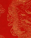
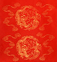
Gold-Etched Red
This red paper has a gold etching that depicts a swirling pattern of a dragon and phoenix. This is in the form of a round pattern about 22cm (9") in diameter. This pattern repeats about once every 33cm (13") down the length of the paper.
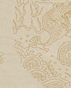
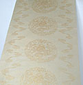
Gold-Etched Tan
This light tan paper (a bit darker than beige a bit ligher than tan) has a series of dragon patterns etched in a shiny gold. This round swirling dragons pattern is about 22cm (9") in diameter. This pattern repeats about once every 33cm (13") down the length of the paper
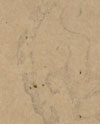
Ink-Stamped Tan
This is a great choice if you want an old-looking calligraphy wall scroll.
This is a traditional stamped paper. The stampings were done with watered down Chinese ink. By design, it is hard to tell what the symbols are. I will leave a little of the mystery, but some of them may be ancient dragon and tiger silouettes, and others are round seals containing ancient zhuanshu characters. A different symbol is printed about every 33cm (13"). This style of paper is available for both vertical and horizontal calligraphy artwork.
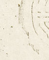
Ink-Stamped Beige
This is a beige paper with water-ink stampings.
This is a traditional stamped paper. The stampings were done with watered down Chinese ink. By design, it is hard to tell what the symbols are. I will leave a little of the mystery, but some of them may be ancient dragon and tiger silouettes, and others are round seals containing ancient zhuanshu characters. A different symbol is printed about every 33cm (13"). This style of paper is available for both vertical and horizontal calligraphy artwork.
Plain Papers
No gold flakes, no stampings, and no fiber or accents

Plain White
Not much to say, plain white is plain white. Please consider the natural fiber paper above before you choose this one. I have to very carefully handle this paper, as just like having white carpet in your home, this paper is dangerously easy to mark or stain. Even clean fingerprints make permanent marks.
Plain Tan
This is a good choice if you want a plain paper (if you do not like gold flakes). It is dark, and does not show dust or age (it has an old classic look already). It will stay looking great for decades, and go with almost any decor.
Great with gold silk, also good with ivory, light green, light blue, and medium green.
Plain Red
Red is a festive or good-luck color in China, so wall scrolls with red often signify a special occasion. Most will choose red paper with a gold-flake background, but if you are not a fan of the gold flakes or accents, this is a good choice for your special scroll.
Goes well with white, ivory, or gold silks.

Plain Orange
Orange is a very viberant color. I imagine you have a special purpose in mind if you are choosing this orange paper.
Goes best with white silk and perhaps ivory. You are on your own for other combinations.
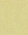
Plain Yellow-Hue
This was supposed to be beige, but when the batch of paper arrived, I found it was another "beige with a yellow tint". This looks good with gold silk. Some people also like it with white or ivory. An interesting look might be light green silk.
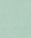
Plain Light Blue
This is not a common color for calligraphy. White silk is the only color that I would feel safe in recommending. I have seen it mounted with gold silk, but it was not to my taste (beauty is in the eye of the beholder).